An event poster or flyer gets read when someone can tell what the event is, when it is and where it is in a few seconds. Make those three things the biggest on the page, use strong contrast, cut every line that isn't helping someone decide to come, and leave some empty space so the important parts stand out.
Most flyers that don't work aren't ugly. They're just crowded. Everyone involved has one more detail to add, and the date ends up buried in a paragraph. The tips below will help you fix that, whether you're promoting a fall festival in Mora, a fundraiser in Rio Rancho or a grand opening in Albuquerque.
What should an event poster include?
Start with the short list. If a detail isn't on it, it has to earn its way on.
- What: the event name, plus a few words if the name doesn't explain itself.
- When: the day of the week, the date and the start time.
- Where: the venue and a street address or town people can actually look up.
- What it costs: if people need to know before they come.
- Next step: one web address or QR code for tickets, a schedule or more information.
Write it all out before you design anything. Have someone who knows nothing about the event read it. If they can't tell you what, when and where, the words need work, and a nicer font won't fix that.
Decide what people see first
Good posters have a clear reading order. Whitman College's print team suggests making the event title the first thing people notice, followed by the date, time and location. If the date is the big draw, make it bold or enlarge it.
A simple way to plan it is by distance. Signs.com breaks a poster into long range, medium range and close-up layers:
- From across the street: one big headline or bold image. This is the part that stops someone.
- From 10 to 20 feet: the date, place and a few key details.
- Up close: the web address, sponsors and fine print.
Here's a quick test. Open your poster, shrink it to the size of a thumbnail and squint. If you can still read the event name and the date, you're in good shape. If everything turns to gray fuzz, your layers are too close in size.
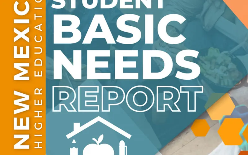
The same idea works on any printed piece. The image at the top of this page is from the redesigned UNM Basic Needs Consortium report. It isn't an event poster, but you can see how one huge title tells you what you're looking at before you read another word.
Event poster design tips that make it easier to read
- Use high contrast. Dark text on a light background, or the reverse. Whitman warns against pairs like light yellow on white. For screens, the W3C's accessibility standard calls for a contrast ratio of at least 4.5:1 for normal text and 3:1 for large text, which is a handy target for your digital versions.
- Limit your fonts. One heading font and one body font is plenty. Three is the most you should use.
- Leave empty space. Whitman suggests keeping about 30 percent of the design empty. It feels like wasted space when you're paying to print. It isn't. It's what makes the headline work.
- Pick one image. One strong photo beats six small ones. Use a real picture of your event, your people or your town if you have one. Our post on growing on Facebook and Instagram explains why real photos earn more trust.
- Be careful with type over photos. Text across a busy photo gets lost. Use a calm part of the image or a solid color block behind the words.
- Skip the all-caps paragraph. Capitals work for a short headline, but they're slow to read in a block of text.
Setting up a flyer for print
A design can look perfect on your screen and still come back from the printer wrong. Before you send anything, ask your print shop for its file requirements, then check these:
- Bleed: if color or images run to the edge, the University of Minnesota's printing service recommends 0.125 inches of bleed past the trim line on every side that bleeds.
- Safe area: keep your text and logos well inside the trim, so nothing important gets cut off.
- Image quality: use high resolution images at the size they'll print. A picture pulled from a website or social post will often look soft.
- Logos: use a vector file when you can. Our logo file checklist explains which file does what.
- A test print: print one copy at actual size and tape it to a wall. Then walk away from it. You'll catch problems you'd never see on screen.
Proofread like the event depends on it, because it does. Check the day of the week against the date, then look up the address and try the phone number and web address yourself. It's a lot cheaper to catch a typo now than after 200 copies come back.
QR codes: use them, but don't rely on them
A QR code is a handy next step, but it should never hold your only copy of the important details. Someone may not want to scan it, and service can be spotty in parts of New Mexico. Print the web address next to it, and keep the date and location on the poster itself.
Size it for how far away people will be. Bitly recommends at least 2 cm by 2 cm and a roughly 10 to 1 scanning distance, so a code scanned from about 10 feet away should be about a foot wide. Leave clear space around it, and test the printed copy with a couple of different phones before you hand out the stack.
Turn one design into your digital versions
Your poster shouldn't stop at the print shop. The same design can carry your event online, as long as you rework it for each shape instead of just uploading a photo of the flyer.
- Instagram feed: Oktopost recommends 1080 x 1350 pixels. Your profile grid crops to 3:4, so keep text and logos away from the left and right edges.
- Facebook event cover: 1920 x 1005 pixels is a common working size, but Meta doesn't publish a firm spec, so keep key text in the center and preview it on a phone.
- Stories and reels: use a tall version with even fewer words. Sizes change, so check the current numbers when you make it.
Keep the same colors, type and main image everywhere. That's how a street poster and a Facebook post start to feel like one event. It's also what we aimed for with the Valley of the Mills tour, where every flyer, post and sign was designed to look like it belonged together.
Don't let the flyer be the only place the details live
A flyer posted as an image can't be read by a screen reader unless you help it along. The University of Arizona's accessibility guide says to write the caption first with all the essential information, add alt text, and avoid "See flyer for details". It's good for everyone else too. Typed details can be copied into a calendar, and they're much easier to read on a small screen. In the post, put what, when, where and how much in plain words, then let the graphic do the attention-grabbing.
Give the event a simple web page as well. Then the poster only needs one address, and you can update the schedule without reprinting anything.
Where to hang event posters in Albuquerque
Before you head out with a staple gun, know the rules. Albuquerque's city code, section 9-8-20, bars posting commercial handbills, signs, notices and posters on lamp posts, public utility poles, street medians, the public right-of-way and shade trees, along with public structures and buildings, unless it's authorized or required by law. Other towns have their own rules, so check before you post, and read the current code if you have a question. We're marketers, not lawyers.
The better spots usually come with permission anyway. Ask coffee shops, restaurants, libraries, community centers, churches, schools and shops near your venue. Put your poster where your people already stop and wait, and leave a small stack of flyers at the counter if the owner is okay with it. Then come back and take everything down once the event is over.
When a full print and digital package makes sense
A single flyer for a small gathering is a great do-it-yourself project. It gets harder when you need posters, handouts and social graphics that all match, and you still have an event to run. That was the job for a Fall Festival and Car Show in Mora, and here's what Rebecca Montoya told us afterward:
"Thank you very much for all the printed posters, flyer designs, and digital marketing for Saturday’s Fall Festival and Car Show event.
All went well, attendance/participation was great. Weather couldn’t have been better. Thank you for all you do!"
Rebecca Montoya, Mora, NM
Once your poster is ready, the next step is getting people talking about it. Our guide on getting your event covered by local news walks through how to reach New Mexico newsrooms.
If you'd like help, our social media and content marketing services include flyers, banners, content creation and the social plan around them. You can book a call here.
Frequently asked questions
What should be on an event flyer?
At minimum: the event name, day and date, start time, location, and one way to get more information or tickets. Add the cost if people need to know it before they come. Sponsors, full schedules and fine print should come after that, or move to a web page.
What is the difference between a poster and a flyer?
A poster is made to catch someone from across a room or down a sidewalk, so it needs fewer words and bigger type. A flyer is held in the hand, so it can carry more detail. Many events need both, built from the same design.
How much bleed does a flyer need for printing?
If color or images run to the edge, the usual bleed is 0.125 inches on all four sides, with important text kept well inside the trim line. Check with your print shop, since each shop has its own file requirements.
Can I hang event posters on utility poles in Albuquerque?
Generally no. Albuquerque's city code bars posting commercial handbills, signs, notices and posters on lamp posts, utility poles, street medians, the public right-of-way and shade trees, with limited exceptions. Ask local businesses, libraries and community boards for permission instead, and check the current code if you're unsure.
 Work with DYAD MarketectsSocial Media & Content Marketing in Albuquerque →

Drafted with AI assistance from DYAD project notes, then reviewed, edited and fact-checked by Vincent King.