 ×

The client
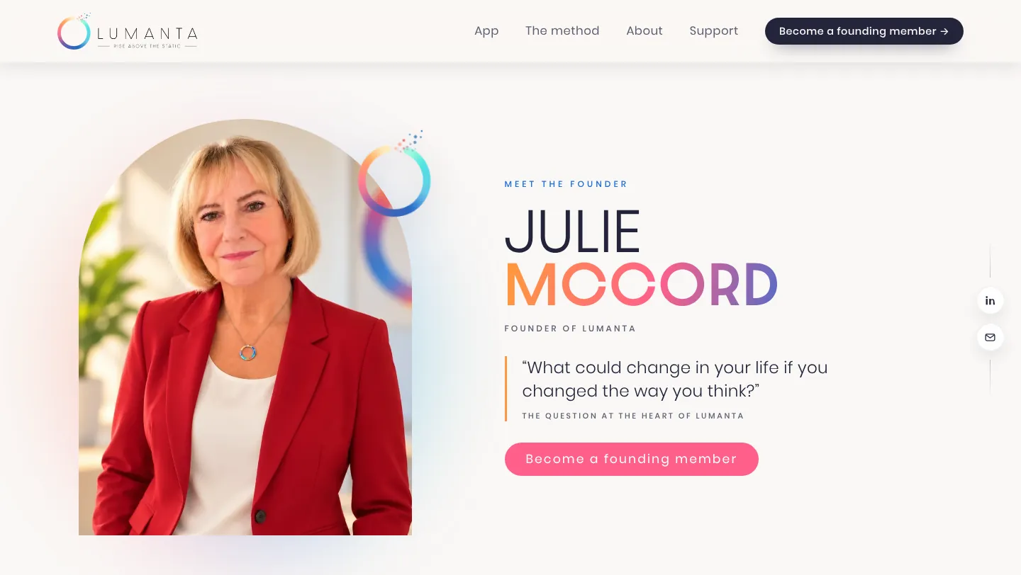
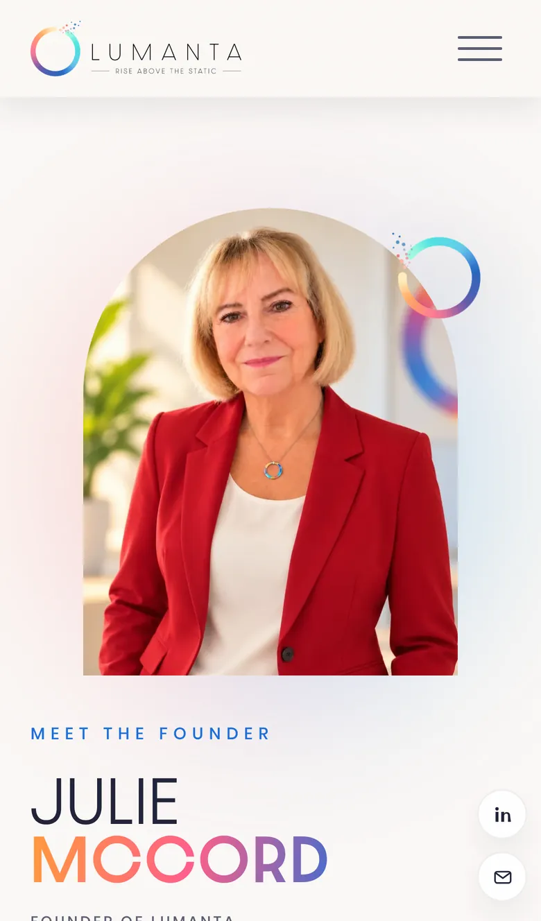
Lumanta is a thought-awareness app from founder Julie McCord, built around three simple steps: Catch, Shift and Rise. You catch a negative, fearful or judgmental thought with a single tap, notice it without judgment and let it go. No journaling, no analyzing, no judging yourself. Its tagline says it best: rise above the static.
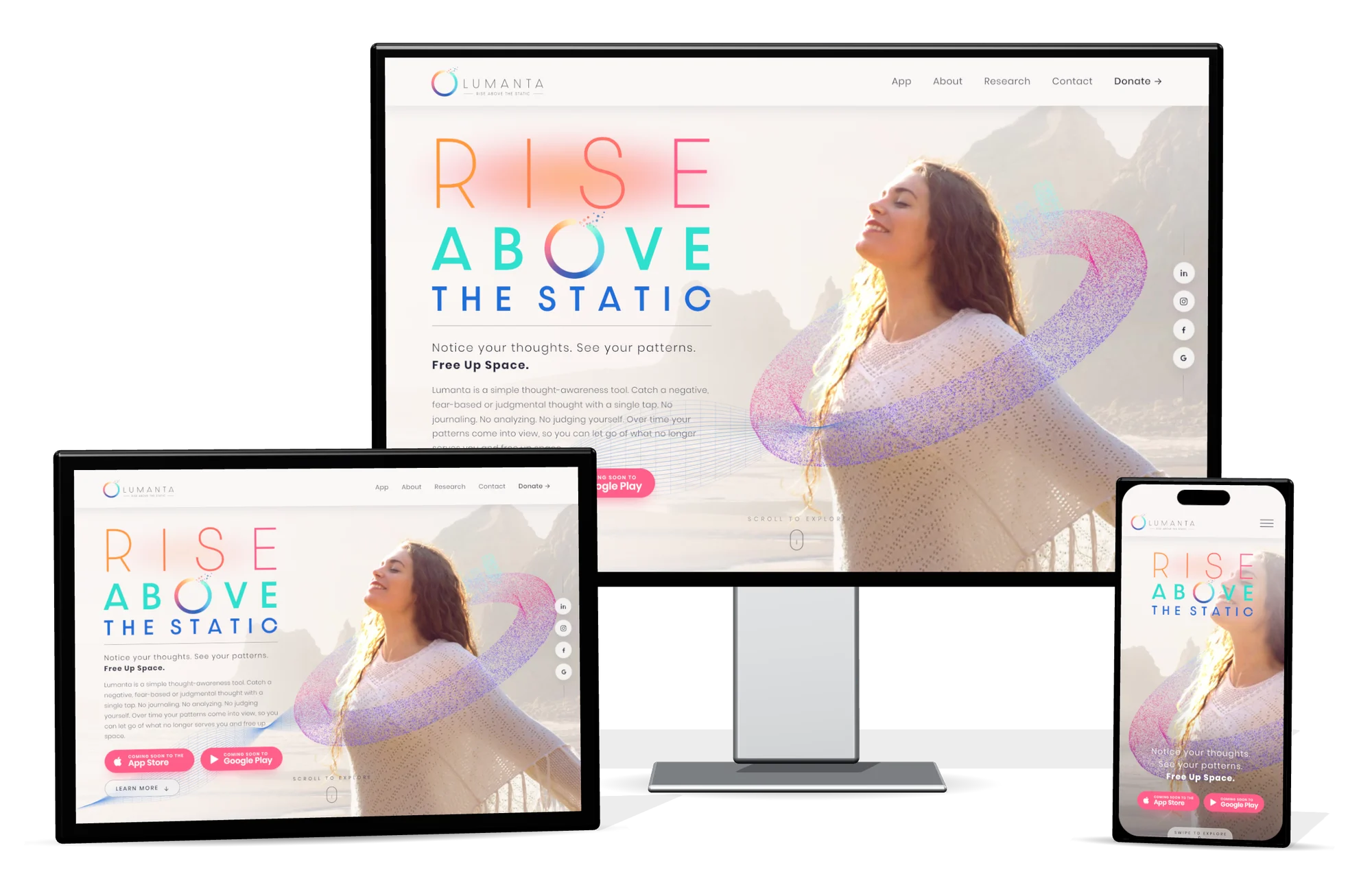
The new website is now live at lumanta.co, with the app coming soon. Julie needed a brand and a website that feel as calm, clear and uplifting as the experience itself.
Step one: the BRAND$TORM
Every DYAD project starts with a BRAND$TORM, our discovery consultation. We sat down with Julie to get to the heart of Lumanta: who it's for, how it should feel, and what makes it different from every other wellness app on the shelf. That conversation shaped every decision that came after it, from the colors to the way the site moves.
Step two: a logo refresh
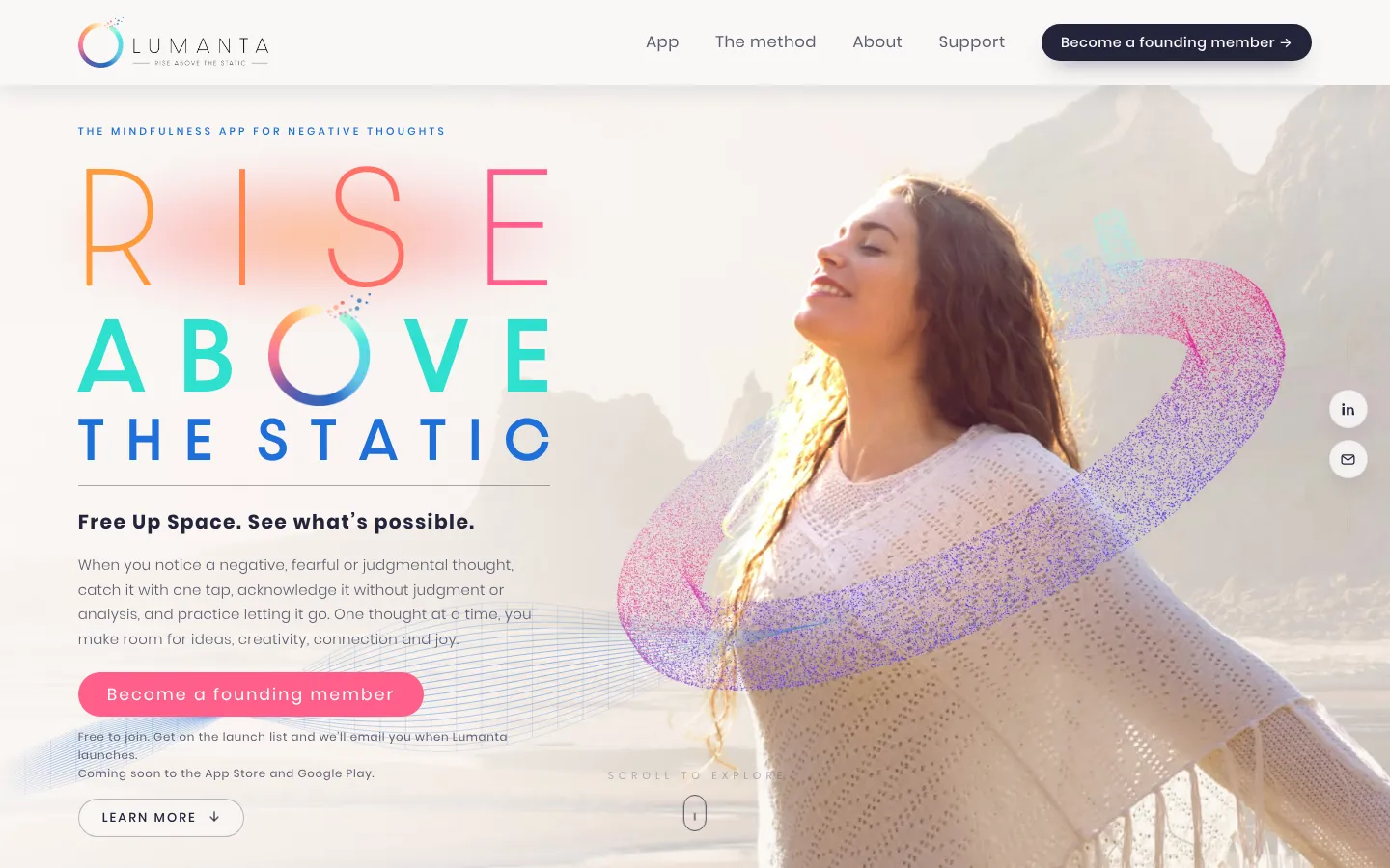
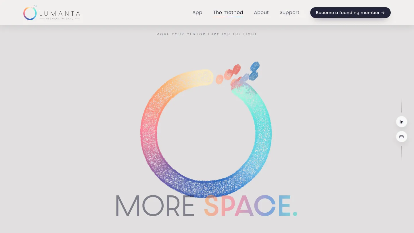
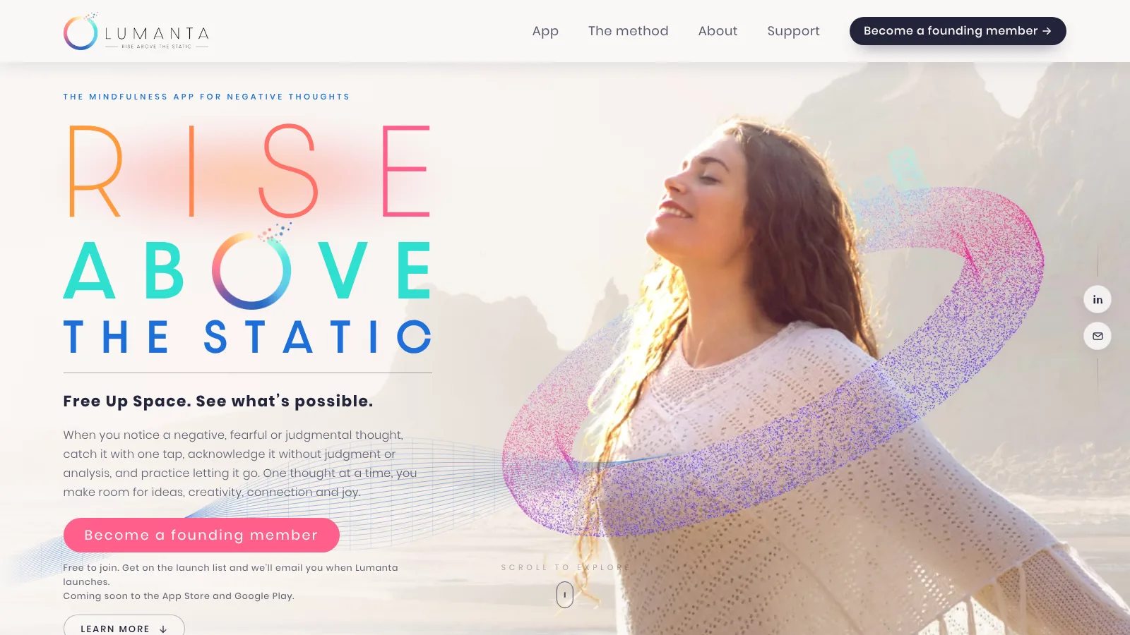
Next we refreshed the logo. The logomark is a glowing ring that breaks into particles at the top, like a thought lifting away. It's set in a warm to cool gradient of ember orange, glow pink, lumen blue and aurora aqua, with Dazzle Unicase lettering that feels light and modern. That ring became the backbone of the whole website.
Step three: a website you feel, not just read
Most sites tell you what a brand is about. We wanted Lumanta's site to let you feel it. A few of the moments we built:
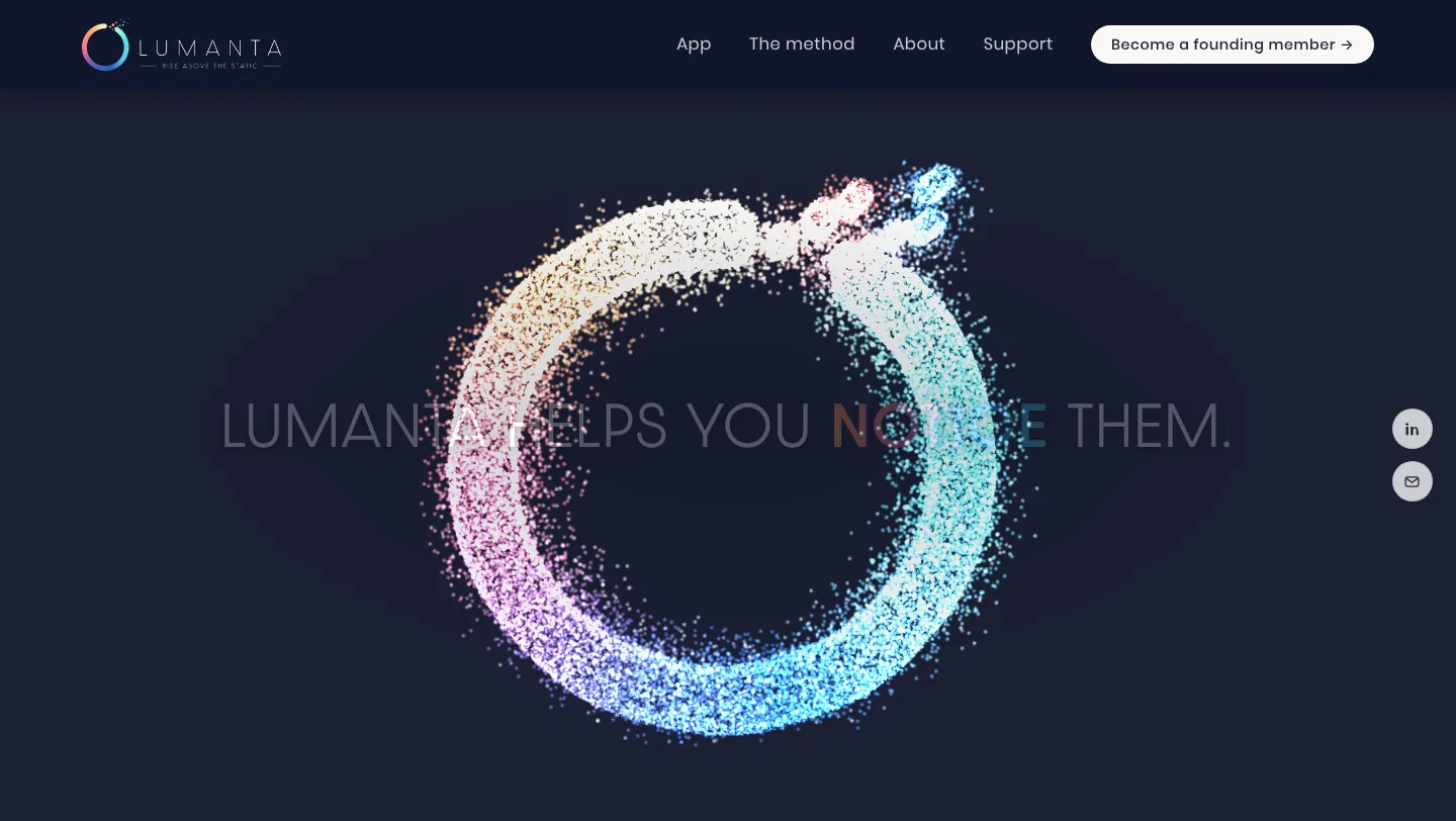
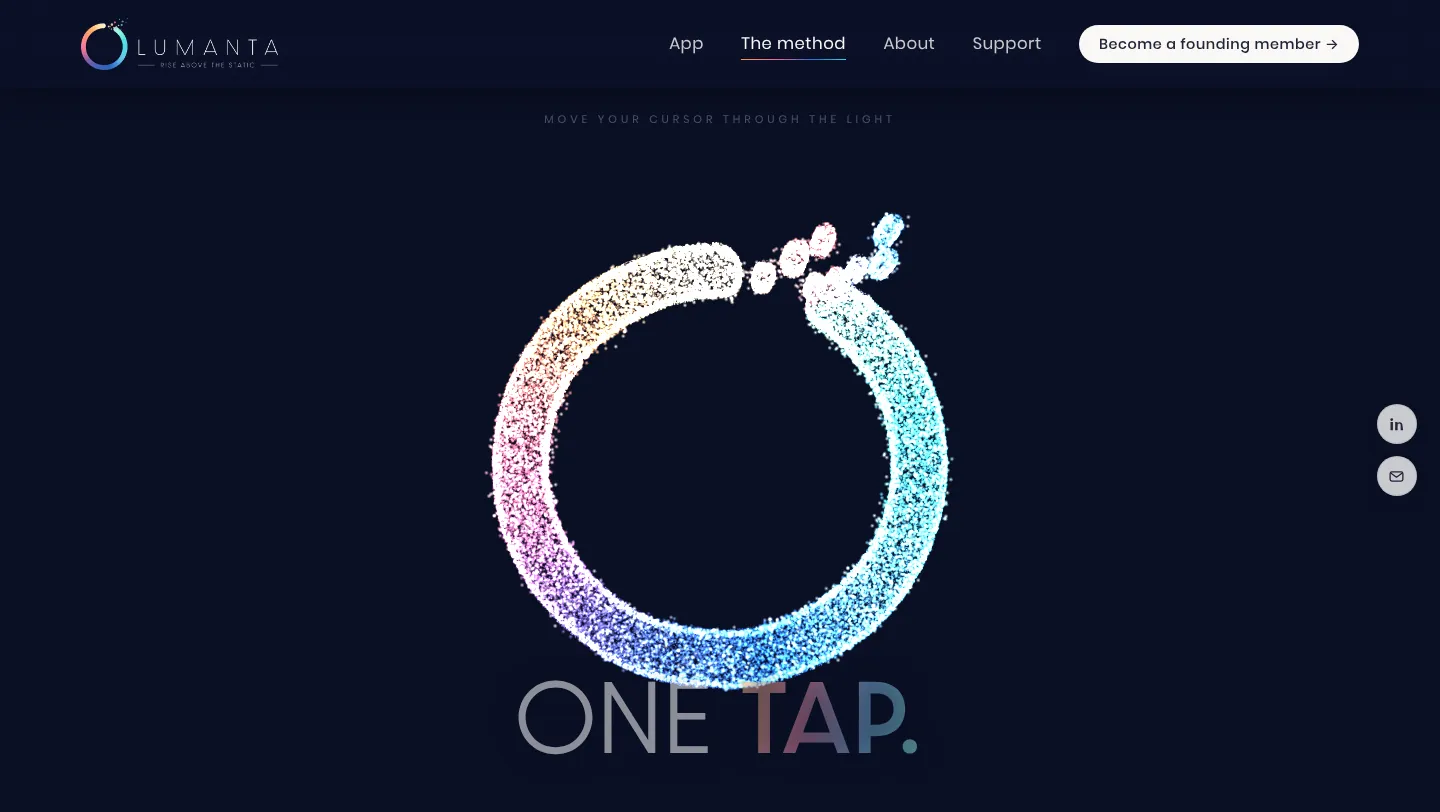
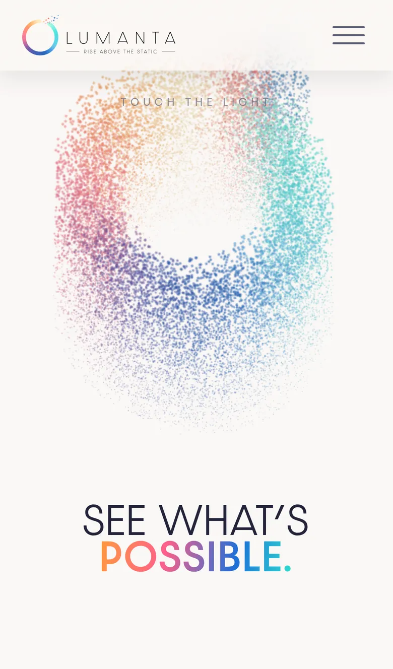
- A particle intro. The logomark assembles from 72,000 particles, then the camera flies through the ring and into the site.
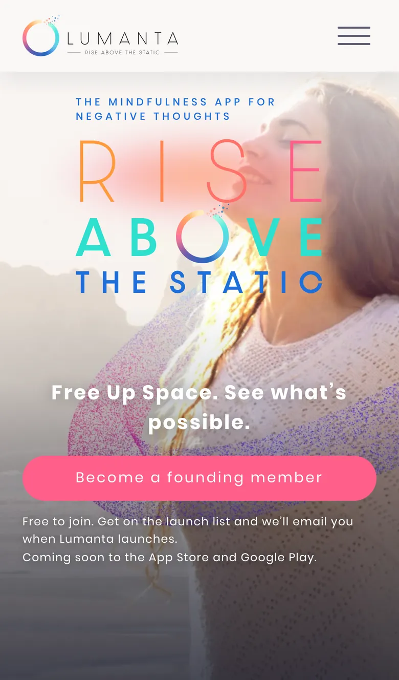
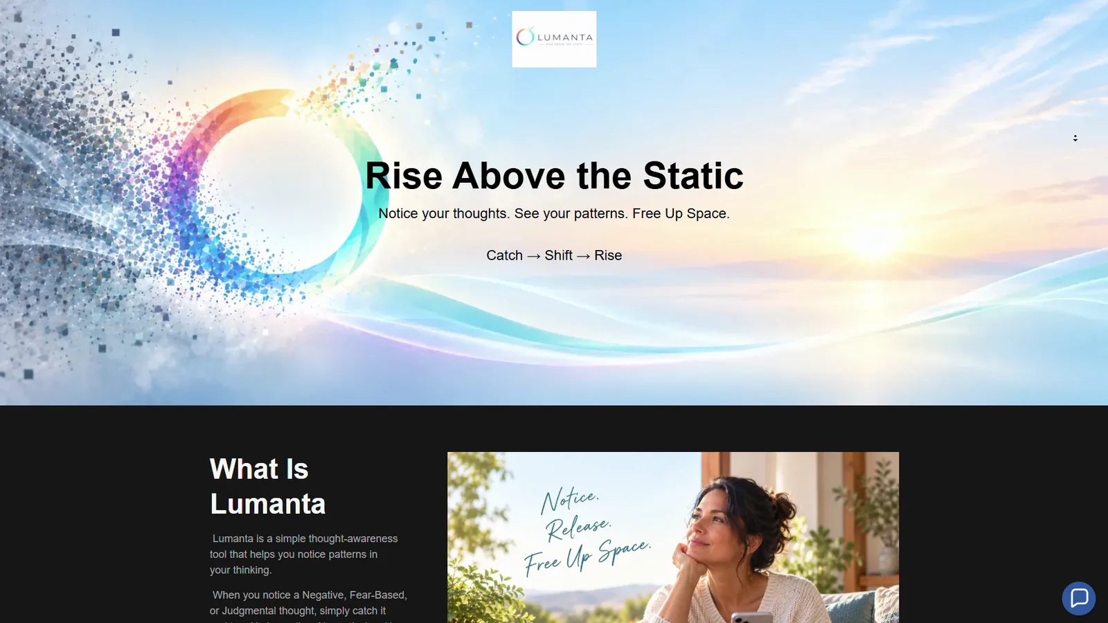
- A cinematic hero. A full-screen video with the Rise Above the Static headline, where the O in ABOVE is the logomark itself.
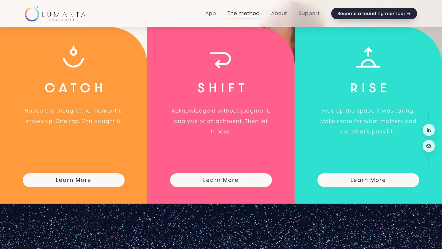
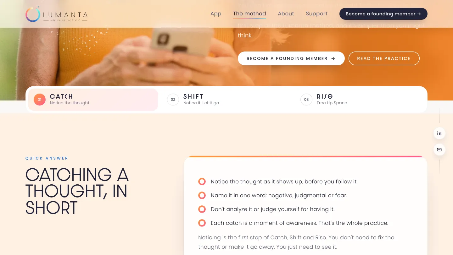
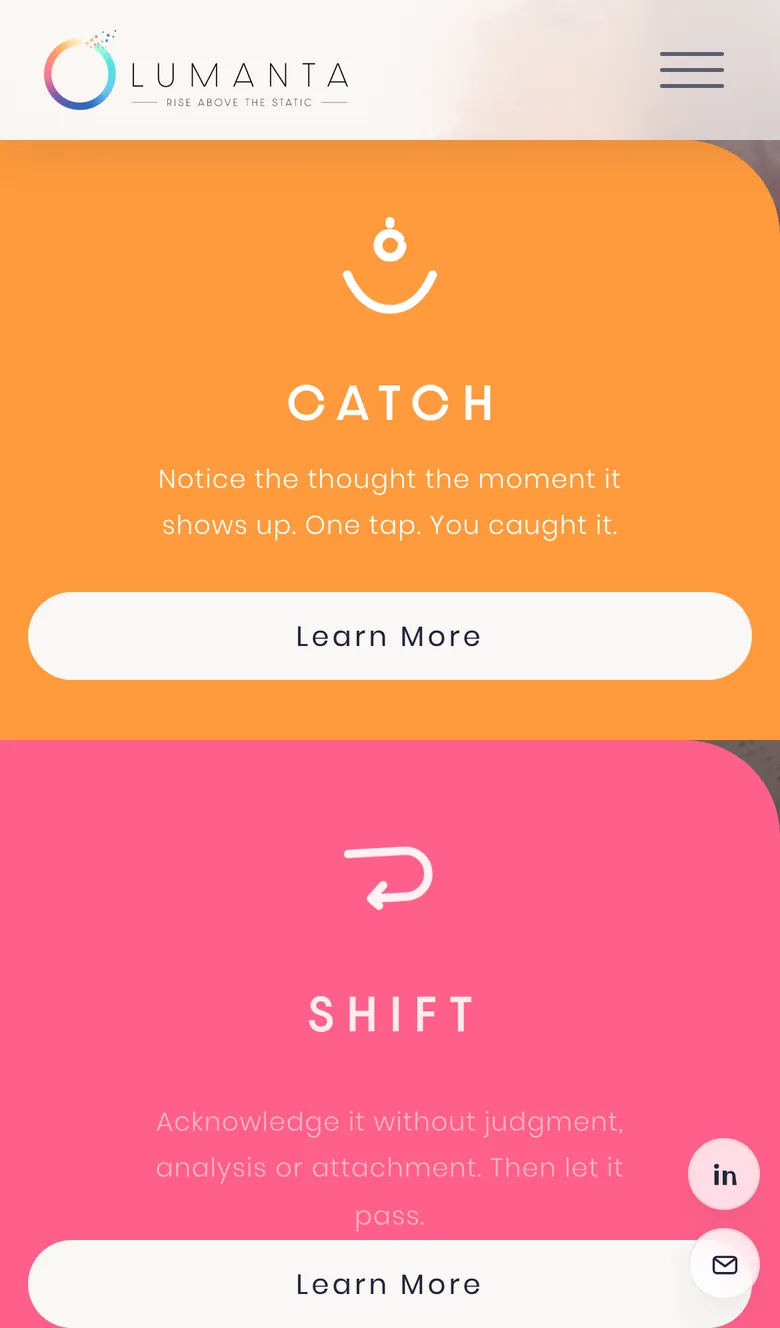
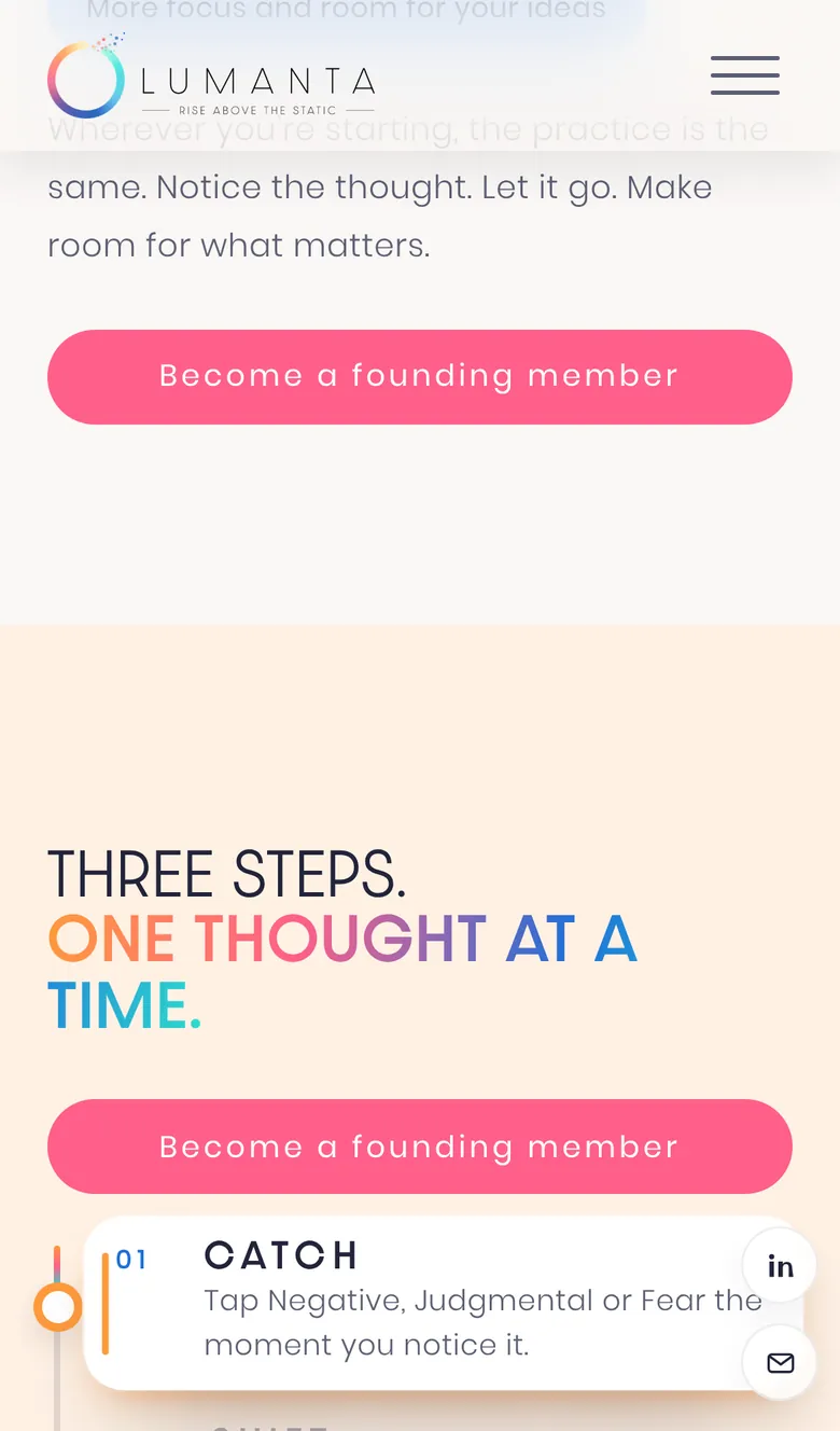
- Catch, Shift, Rise. Three color cards slide up over the hero, each with an icon that draws itself, and each opens its own page.
- The static. A scroll-driven 3D particle story where noise gathers into the logo and the night sky dawns into Lumanta's soft off white. Move your cursor, or your finger on a phone, and the particles move with you.
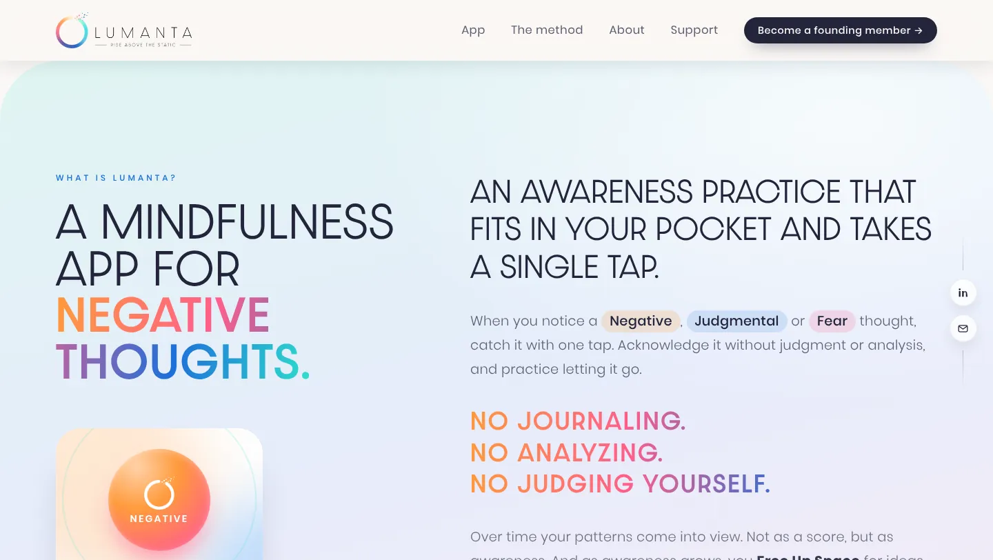
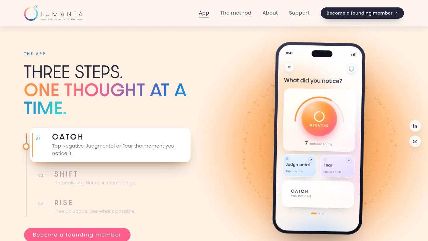
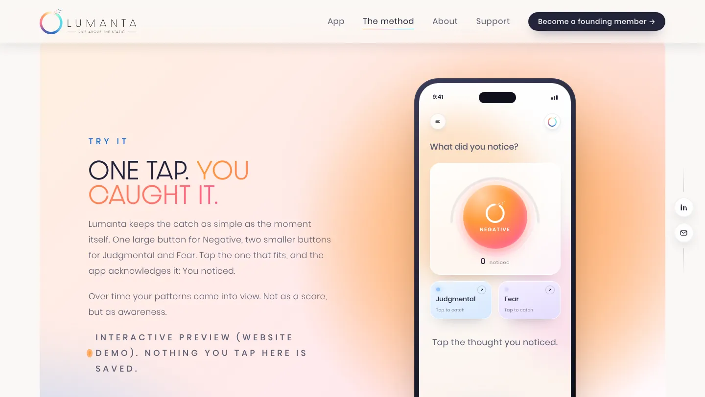
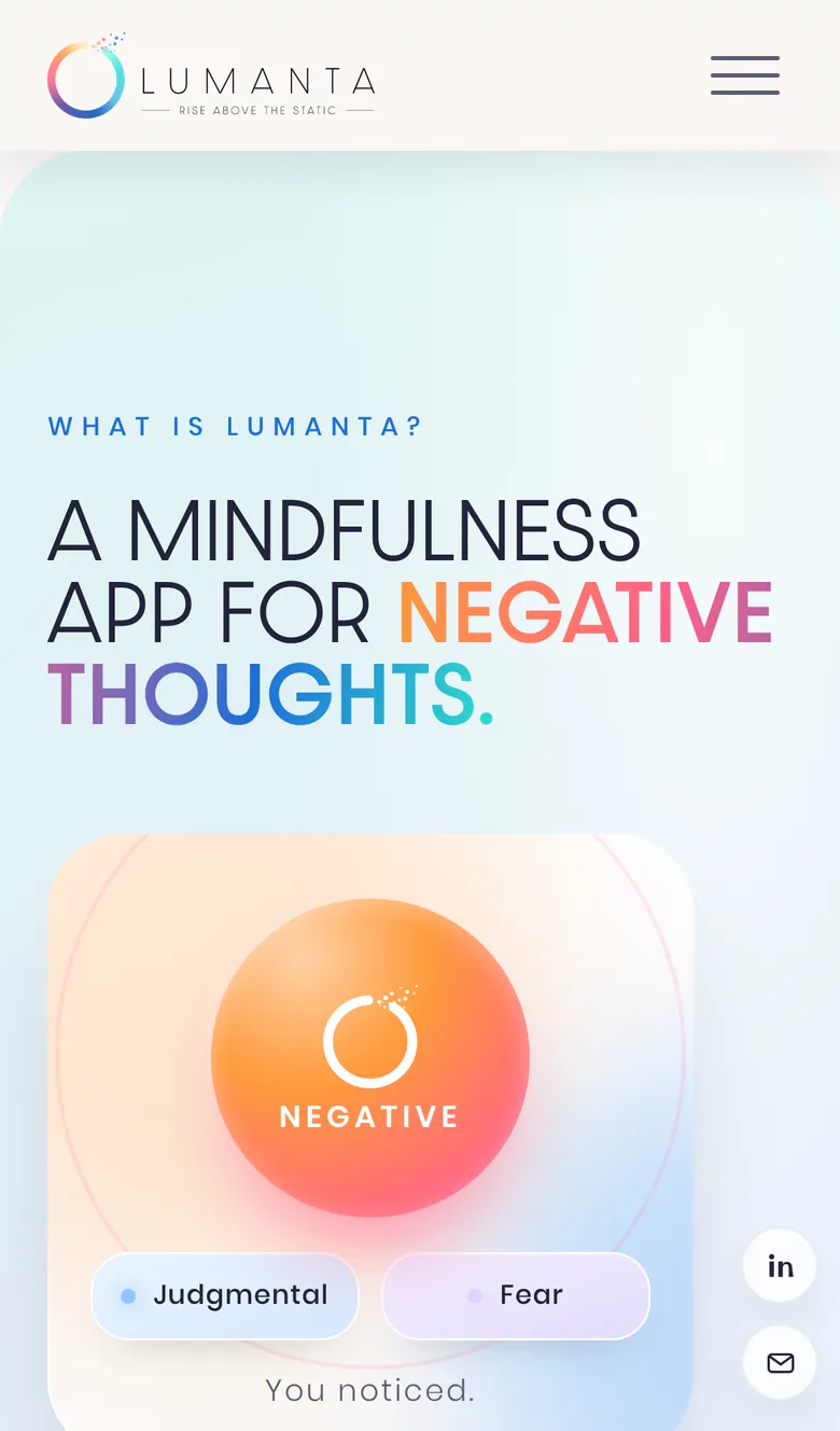
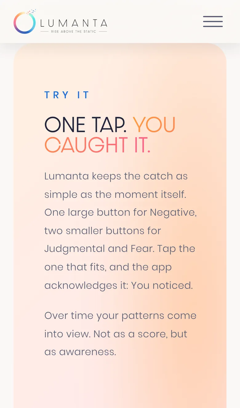
- The app walkthrough. A phone that stays pinned while you scroll through the app's three steps: one big Negative button, Judgmental and Fear below, in soft daylight colors with glowing particle rings behind it.
Every section has its own entrance animation, and it all works on phones too, with touch built in rather than bolted on. Visitors who prefer reduced motion get a calm, still version automatically.
Pages built to be found
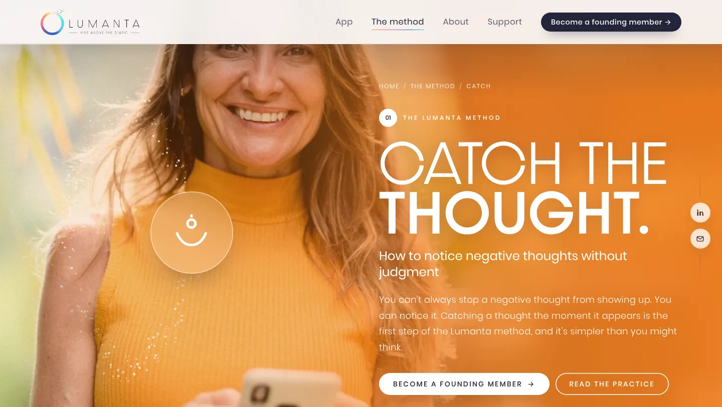
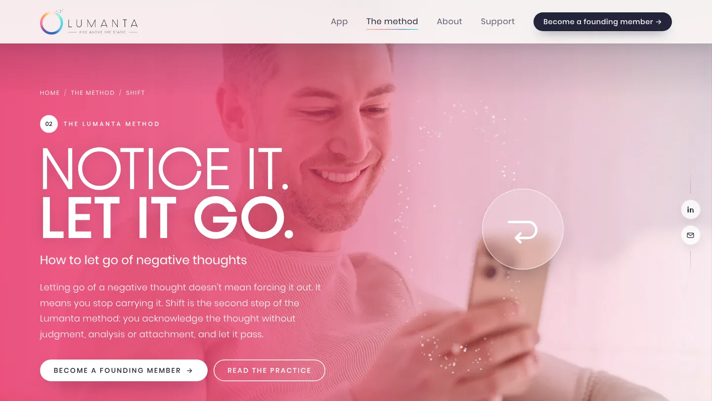
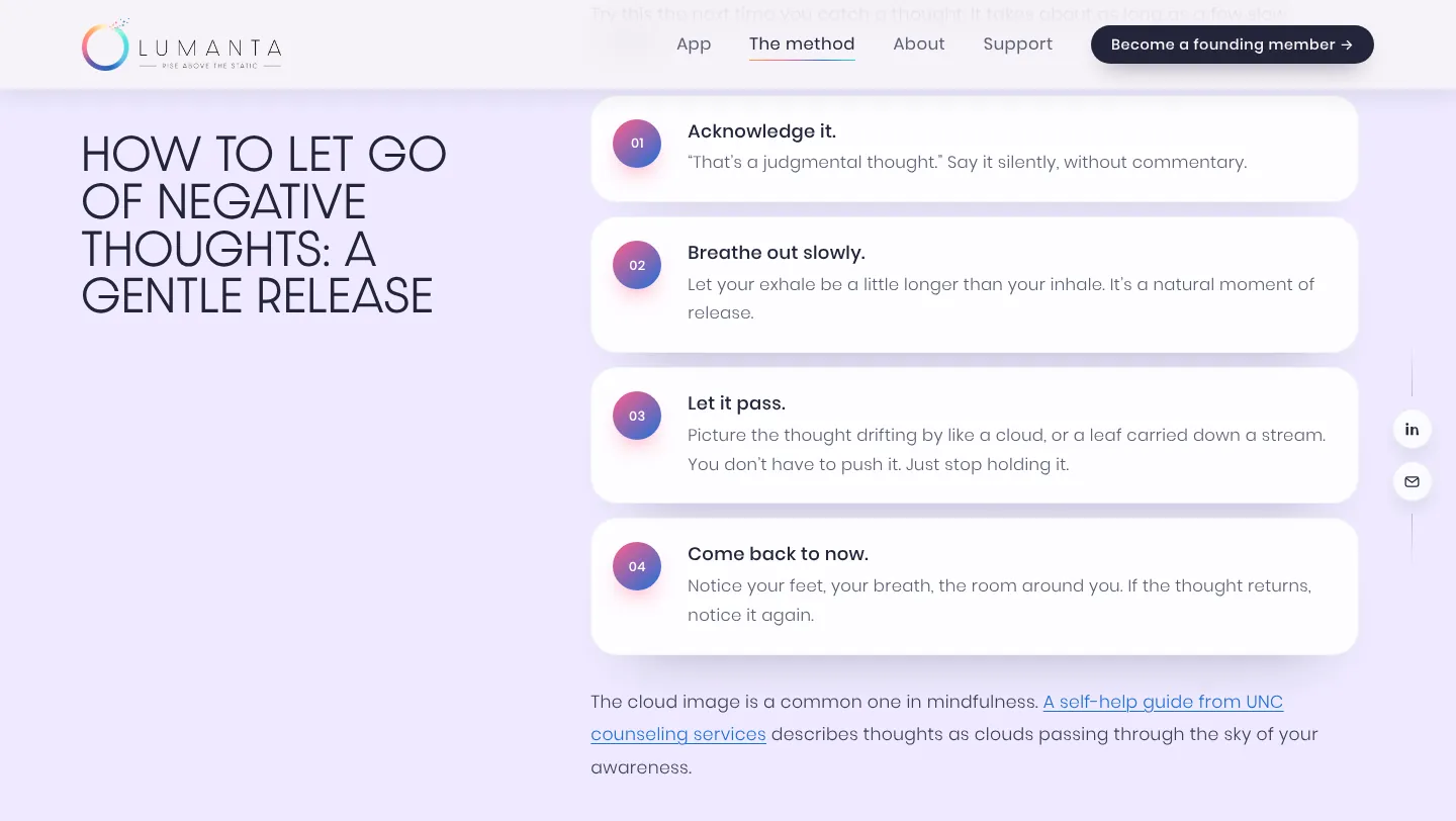
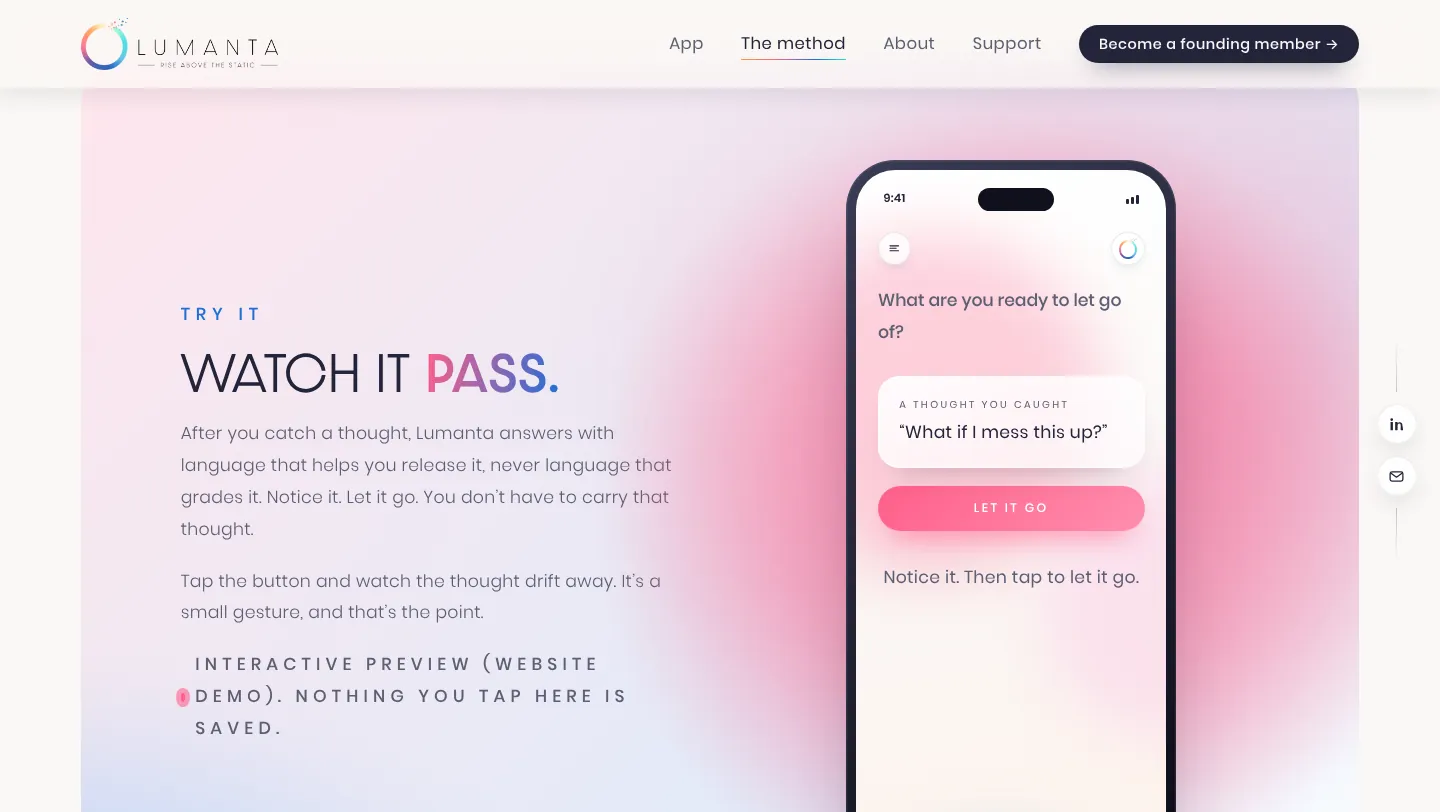
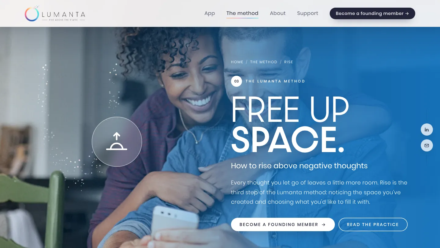
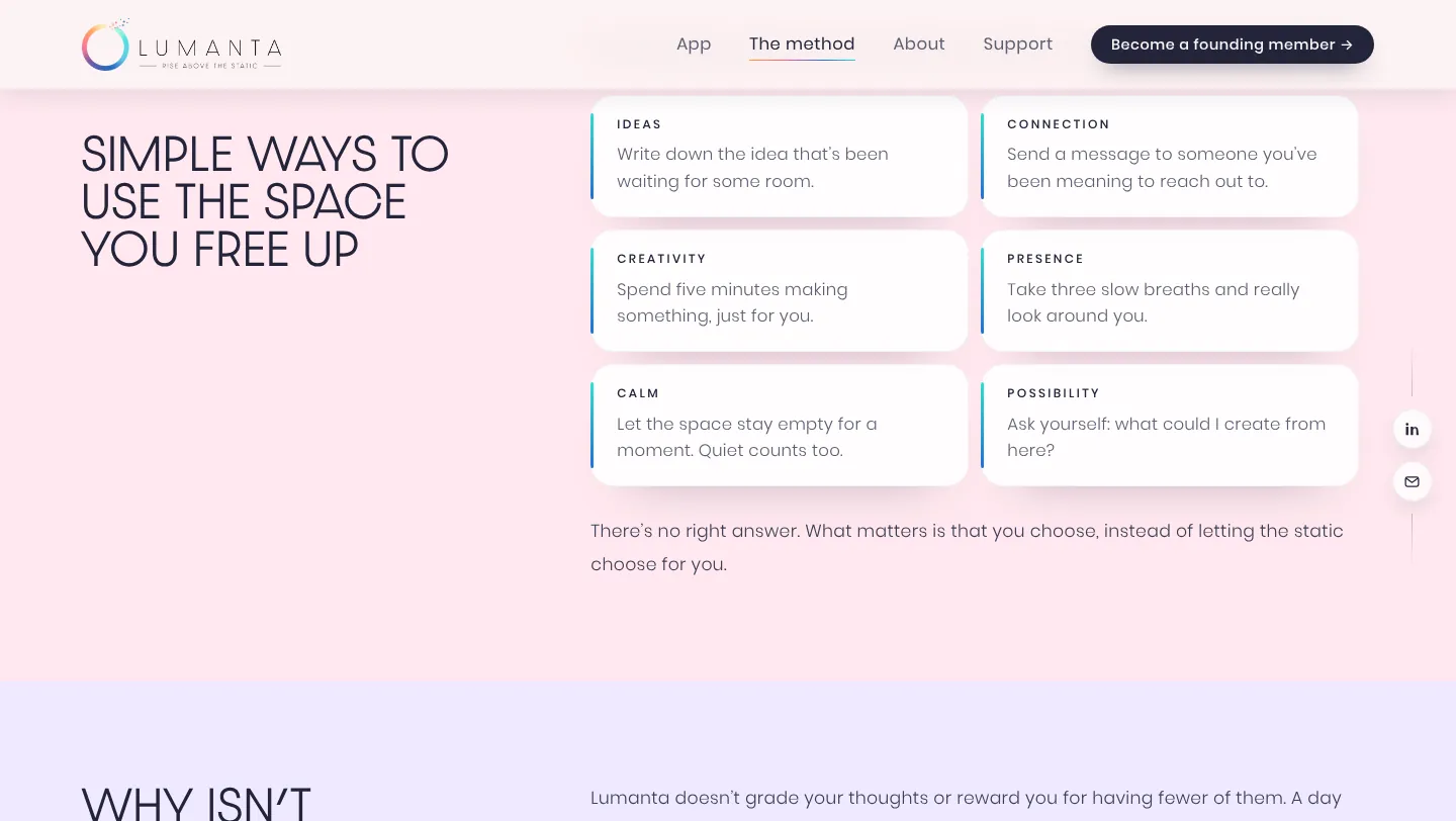
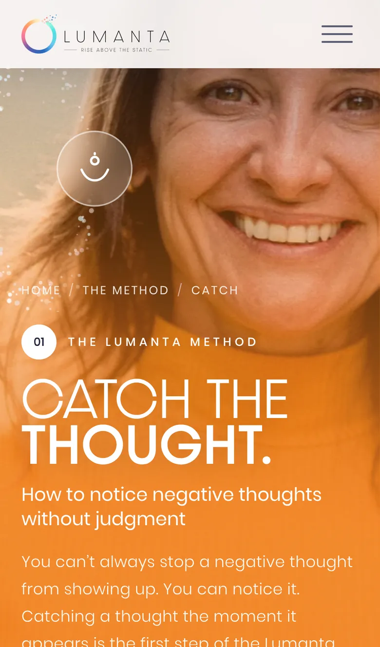
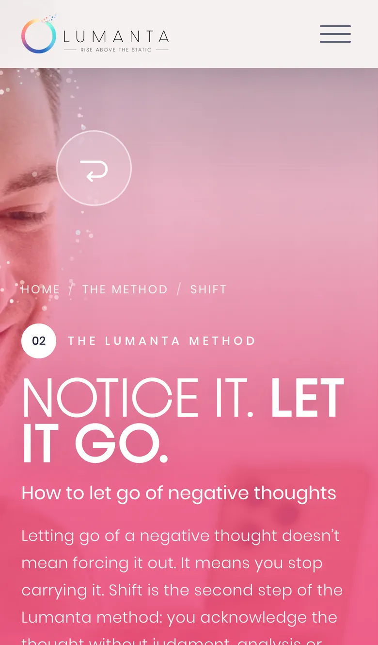
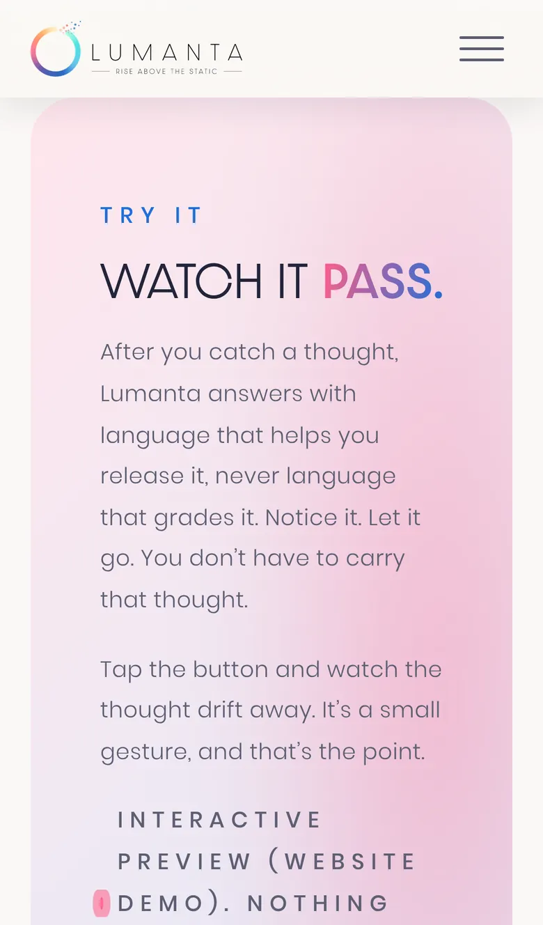
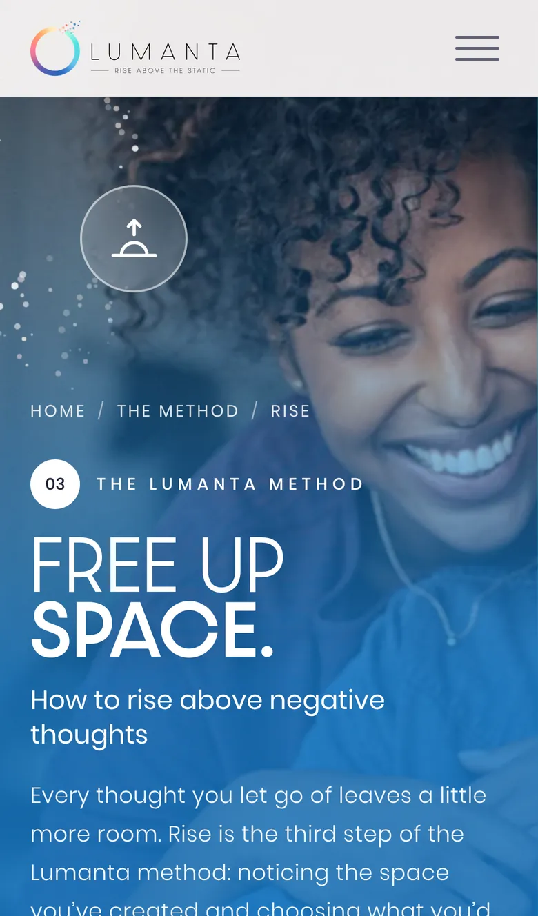
After launch we refreshed the brand around Julie's messaging and added three pages, one for each step of the method: Catch, Shift and Rise. Each one answers a real question people search, like how to let go of negative thoughts, with a full-bleed photo hero, a scroll story where the logo's particles act out the step, and a small demo you can tap.
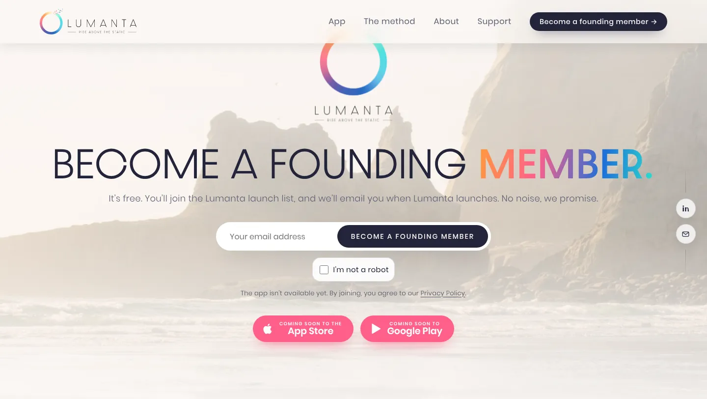
The “Become a founding member” form saves every signup to a shared sheet and alerts both Julie and our team, with a privacy-friendly “I'm not a robot” check and a cookie notice that keeps visitors in control.
Luxury design, backed by SEO
This is a $10,000 level website at a cost a startup can actually afford. And it isn't just pretty. It's built with search in mind from day one: clear page titles and descriptions, social share cards, fast loading video sized for phones, and an llms.txt file that helps AI assistants describe Lumanta accurately. Now that it's live at lumanta.co, it's built to be found. Want to know what goes into that? Here's our website redesign checklist.
Why it looks like nobody else
Choosing a web designer is like picking your favorite artist. When you choose DYAD, you get Vincent King's bold, immersive style. No boring AI layouts. No basic Wix or WordPress templates. Just a site built from scratch around your brand, so visitors feel it the moment it loads.
If you want a website that makes people stop scrolling, see how our web design works or book a call below.